Where the charts are
There is no separate charts screen and nothing to switch on. Run any module and the result panel builds itself in the same order every time: a summary bar across the top, then the CSV button, then the chart, then the table the chart was drawn from. Scroll down from the form and the chart is the first thing you meet.
| Module | Chart | What it plots |
|---|---|---|
| Square of Nine | Spiral wheel | Every returned level on the spiral, at its true angle and ring |
| Ingress | Zodiac wheel | Each ingress on the sign boundary the body actually crossed |
| Bradley Siderograph | Siderograph | The composite against a real date axis, with its three components available |
| Cycle Scanner | Power spectrum and composite cycle | Power against period, then the fitted composite over your own bars |
| Ephemeris | Aspect timeline | One lane per planet pair, one marker per exact-aspect day |
| Historical Analogs | Similarity curve | Similarity across the whole scan window, with the ranked matches numbered |
Each module guide has a Reading the chart section that goes through its own visual grammar. This page covers only what all seven charts have in common.
The hover readout
Move the pointer anywhere across a time-series chart and a small plate appears with the exact values under the cursor. It is not a rounded label pinned to the nearest drawn point. The chart looks up the underlying data row for the position you are actually on.
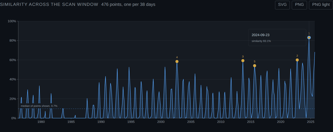
That is the check worth doing once, on any module: hover a marked point, then scroll to the table and find the same row. If they ever disagree, something is wrong and you should tell us.
The readout is furniture, not data
The crosshair and the readout plate exist for the screen. They are stripped out of every download, so an exported chart never has a stray tooltip frozen into it wherever your mouse happened to be.
The three download buttons
Every chart carries the same three buttons in its top right corner.
| Button | You get | Use it for |
|---|---|---|
| SVG | Vector. Infinite resolution, editable in Inkscape or Illustrator, every element still a named object | Anything that will be resized, recoloured, or annotated later |
| PNG | Bitmap at twice the on-screen size, dark theme, matching what you are looking at | Pasting into a message, a forum post, or a dark-background deck |
| PNG light | The same bitmap on a white ground with dark text | Anything that will be printed or dropped into a white document |
All three are produced in your browser. Nothing is sent to the server to make an image, so a download costs no compute units and works the same whether you are on the free plan or not.
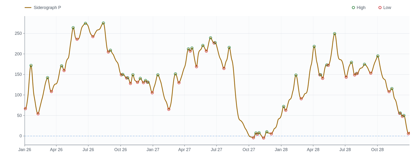
The file name is built from what you asked for, not from a counter, so a folder of exports stays readable months later. A siderograph run over three years lands as bradley_2026-01-01_2028-12-31.png. The light version of the same chart appends -print, so it is bradley_2026-01-01_2028-12-31-print.png and the two never overwrite each other.
The SVG is self-contained
A downloaded SVG carries its own stylesheet inside the file. Open it on a machine that has never visited this site and it still renders with the right colours, fonts and line weights. It does not reach back to us for anything, which also means it keeps working offline and does not phone home when a reader opens it.
Why PNG light exists
The app is dark because you are looking at it for a long time. Paper is not. A dark chart printed on white either comes out as a black rectangle or, if your printer helpfully drops the background, as pale grey lines on white that nobody can read.
PNG light is not the dark chart inverted. The palette is re-derived so the accent, gold, violet and the two signal colours stay distinguishable against white, and the grid drops back far enough to stop competing with the data.
Toggles inside a chart
Two charts have controls of their own, sitting directly beneath them. Both default to the plainest view and both are honest about why.
- Siderograph components. Long terms L, Middle terms M and Declination D can each be drawn alongside the composite, because P is built from them. Off by default so the first thing you see is the curve everyone expects.
- Hide Moon pairs on the aspect timeline. The Moon aspects everything roughly monthly, so it supplies most of the events and swamps the density band above the lanes. One click removes eleven lanes and the clustering that is left is the part worth looking at.
Whatever is on screen is what gets exported. Turn the components on, then download, and the download has the components.
Charts against CSV
The chart and the CSV come from the same response, so they never disagree. Use the chart to see the shape and find the dates that matter. Use the CSV when you want the numbers in a spreadsheet.
Historical Analogs is the one module with two CSV buttons. CSV gives you the ranked matches, which is the table. Curve CSV gives you every point of the similarity line, which is what the chart is drawn from, so you can rebuild or re-scale it yourself.
Printing and slides
- Set the chart up the way you want it, including any toggles.
- Use PNG light for anything on white, PNG for anything on a dark deck.
- Use SVG if somebody downstream will resize it. A PNG scaled up in a slide deck goes soft; the SVG does not.
- Keep the file name. It records the exact inputs, which is the difference between a chart you can reproduce and a picture you cannot.
What a chart is not
Every chart here draws something that was computed. None of them draw something that was predicted.
The dashed forward segment on the composite cycle chart is the detected cycles carried on past the last bar. That is arithmetic on what was measured, not a forecast of price, and the R2 printed beside it tells you how much of your own series those cycles actually accounted for. A low R2 with a confident-looking dashed line is exactly the trap the number is there to spring.
The density band on the aspect timeline says several pairs reached exactness at once. That is a description of the sky. It is not a description of a market, and nothing in this app claims a link between the two.
Not financial advice
Crohamhurst is a calculation tool. It produces dates, degrees, levels and tables. It does not produce recommendations, signals or forecasts, and nothing in this guide is financial advice. Trading carries risk of loss.