What it computes
Give the scanner a series of closing prices and it answers two separate questions. First, which repeating periods carry the most energy in that series. Second, whether the series behaves more like a trend, more like a mean reverting swing, or like a random walk.
The first answer comes from a Fourier transform. The series is detrended, a Hann window is applied to stop the ends of the series leaking energy across the whole spectrum, and the transform is zero padded eight times so the peaks can be located between the raw frequency bins. Peaks in the resulting power spectrum are the candidate cycles, ranked by power.
The second answer comes from a rescaled range (R/S) calculation of the Hurst exponent, run on log returns.
Running R/S on returns rather than on price levels matters. On raw levels the statistic pins near 1.0 for any random walk, which would make every series look strongly trending. On returns it behaves properly: simulated geometric Brownian motion comes out near 0.55, and a simulated mean reverting process comes out near 0.2.
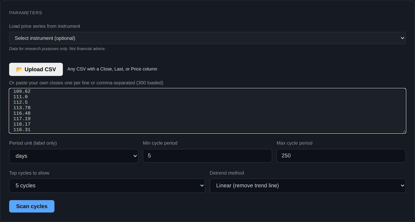
Every input field
| Field | Accepted values | Default | What it does |
|---|---|---|---|
| Load price series from instrument | Any of the 25 instruments | Empty | Fetches daily closes from Yahoo Finance and fills the paste box. Requires Pro. Free and Hobbyist accounts get a 403 from the history endpoint. |
| Upload CSV | .csv or .txt | None | Reads the first column it recognises out of Close, Last, Price, Adj Close or AdjClose. |
| Paste your own closes | Numbers, one per line or comma separated | Empty | The actual input. Minimum 16 values, maximum 2,048. |
| Period unit | days, weeks, months | days | A label only. The server ignores it and always works in bars. It changes the wording on the chart and table, not the maths. |
| Min cycle period | 3 to 500 | 5 | Shortest cycle to report, in bars. |
| Max cycle period | 4 to 1000 | 250 | Longest cycle to report. Effectively capped at half your bar count, because you cannot resolve a cycle longer than that. |
| Top cycles to show | 3, 4, 5, 6, 7, 8 or 10 | 5 | How many peaks to return, strongest first. |
| Detrend method | Linear, Log-difference | Linear | See the warning below. These two answer different questions. |
Linear and log-difference are not interchangeable
Linear fits a straight line to the price series and subtracts it, so what is analysed is price around trend. The cycles you get describe the price swing itself.
Log-difference takes the log return from bar to bar. That shortens the series by one bar and analyses momentum, not price. A momentum cycle leads the price cycle by roughly a quarter of its period, so the "bars to next peak" figure is telling you when momentum peaks, which is typically before price does. If you compare the two methods without knowing this, the dates will look inconsistent when they are not.
Worked example
Scan a year of daily gold closes for repeating periods.
- Open the module. Sign in, then choose Cycle Scanner on the dashboard.
- Load the data. On Pro, pick Gold from the instrument dropdown and the box fills with about 250 daily closes. On any tier you can paste your own closes or upload a CSV instead, which costs nothing extra and works identically.
- Check the count. The label above the paste box shows how many values it parsed. If that number is not what you expect, your separator or a header row is the problem.
- Set the scan band. Min 5, max 120. With roughly 250 bars, asking for a 250 bar cycle would leave you one repetition, which is not evidence of anything.
- Leave the top count at 5 and the detrend on Linear for a first pass.
- Click Run. You get the Hurst gauge, the power spectrum with the chosen peaks marked, the composite drawn over your own series, and the dominant cycles table.
- Read the strongest cycle. Note its period and its power percentage. Anything in the low single digits of power is weak, whatever its rank.
- Re-run with a different window. Drop the oldest 50 bars and run again. A cycle that survives a change of window is worth more attention than one that does not.
Reading the charts
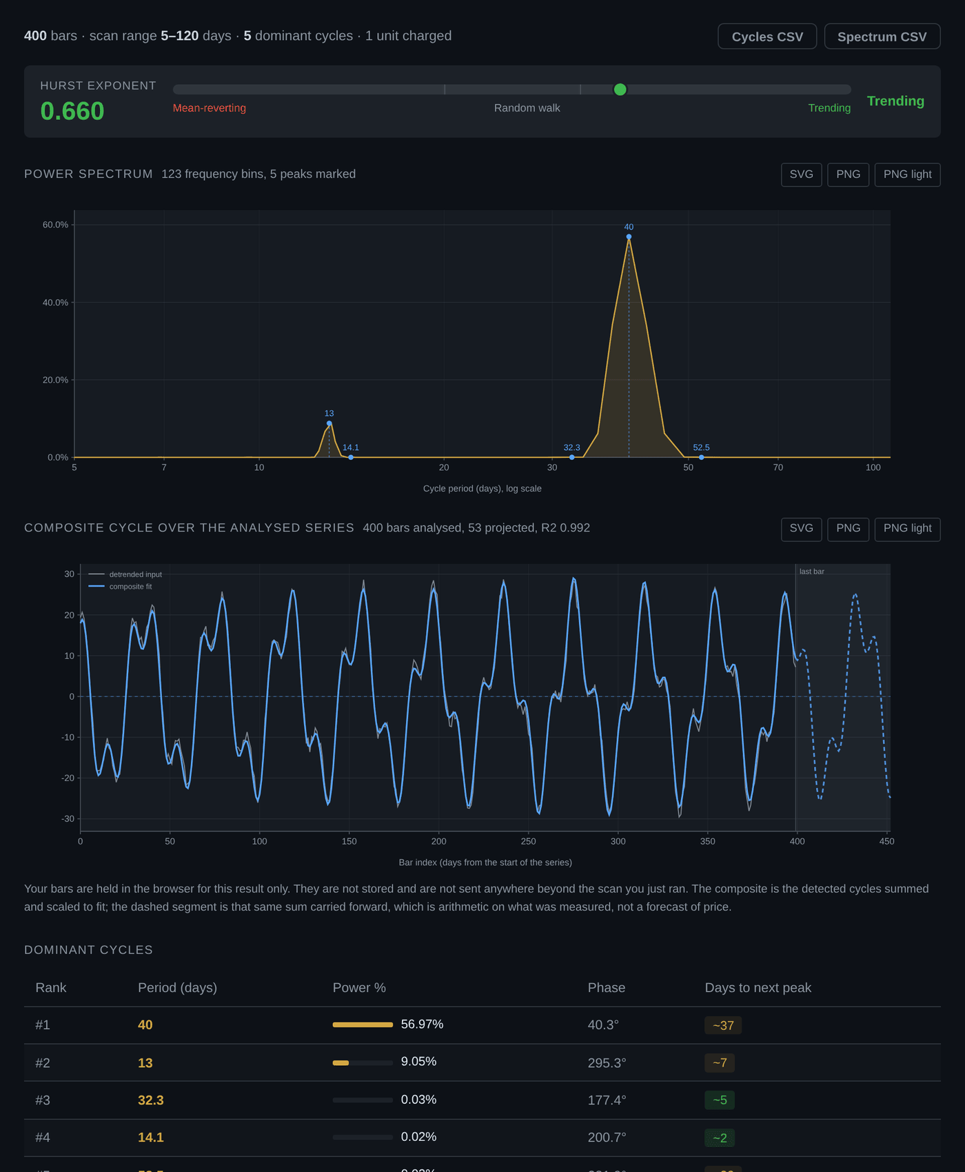
This is the one module that draws two charts. The power spectrum comes first, then the composite over your own series, and the dominant cycle table sits under both. Both are drawn from the same response, so nothing in them can disagree with the table.
The power spectrum
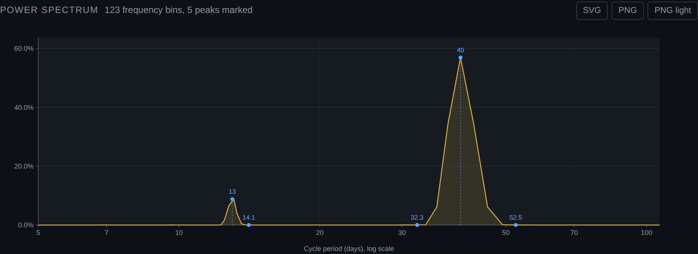
| Mark | Meaning |
|---|---|
| Gold filled area | Power at each period. Height is how much of the series that period accounts for |
| Blue dot with a label | A detected dominant cycle, labelled with its period in bars |
| Dashed blue drop-line | The single strongest peak, dropped to the axis so its period is easy to read off |
The axis is logarithmic for a practical reason. The scanner searches 5 to 250 bars by default, and on a linear axis the first octave, 5 to 10 bars, would be squeezed into about two percent of the width. Log spacing gives every octave the same room, which is how a spectrum is normally read anyway. The ticks land on 5, 7, 10, 20, 30, 50, 70 and 100.
In the run above the five peaks are at 40, 13, 14.1, 32.3 and 52.5 bars, in strength order, so 40 carries the drop-line. Two of them, 13 and 14.1, sit almost on top of each other, which is exactly the kind of thing the chart makes obvious and the table does not: they are much more likely one broad cycle resolved twice than two independent ones.
The composite over your series
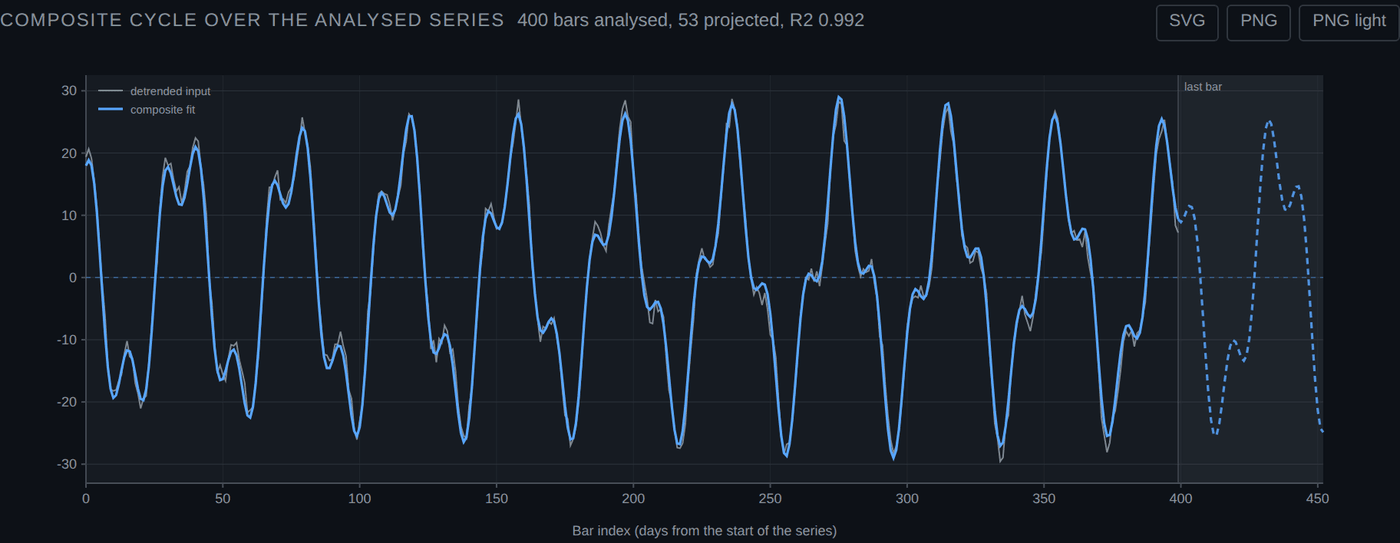
| Line | Meaning |
|---|---|
| Grey | Your own series after the same detrend the scanner applied, either a least-squares line removed or log returns |
| Blue solid | The detected cycles summed and scaled to fit that series |
| Blue dashed | The same sum evaluated forward past the last bar, inside the shaded region |
Only the vertical scale is fitted. The shape comes from the spectrum, the relative sizes of the components come from their power, and a single ordinary least-squares fit sets the overall amplitude and offset. That is why R2 is printed in the header rather than buried: it is the honest measure of how much of your series these few cycles actually account for.
R2 is the number that governs the dashed line
At 0.992 the composite tracks the analysed series closely, which is the best case. A run that comes back at 0.3 will still draw a confident-looking dashed continuation, and that continuation will mean almost nothing. Read the R2 first, then decide whether the forward segment deserves a second glance.
Your bars are not stored
The series is held in your browser for this one result. It is not saved, and it goes no further than the scan you just ran. That is also why this chart is the only one that needs your own data to draw at all.
Reading the output
| Column | What it is | How to read it |
|---|---|---|
| Rank | Order by spectral power | Rank 1 is the strongest peak found inside your band. It is not necessarily strong in absolute terms. |
| Period | Length of the cycle in bars | Labelled with whichever unit you picked, but always counted in bars of your input series. |
| Power % | Share of total spectral power | The scale is calibrated so a clean single sine wave scores roughly 60 to 70 percent. Real price data rarely exceeds a few percent per cycle. Under about 2 percent, treat the peak as noise. |
| Phase | Degrees, 0 to 360 | Where in the cycle the series sat at the start of the window. It is an input to the peak timing, not something to read directly. |
| Bars to next peak | Bars forward from your last bar | Extrapolation of a fitted sine wave. It says where that sine would next peak if it continued unchanged. It is arithmetic, not a forecast. |
| Power spectrum chart | Power against period | The gold area is the power at each period. Blue dots mark the peaks that made the table. Subsampled to at most 120 points for drawing. |
| Hurst gauge | H and its label | A single number for the whole series. It says nothing about any individual cycle. |
Sanity check the top period against your bar count
A cycle needs several full repetitions inside the window before its power figure means much. With 250 bars, a 20 bar cycle repeats twelve times and is testable. A 120 bar cycle repeats twice and is close to unfalsifiable. Prefer periods no longer than about a fifth of your series.
The CSV export
One row per dominant cycle, saved as cycles_<n>bars.csv. The full spectrum is not exported, only the ranked peaks. Note that the first column name carries whichever unit label you chose, so a file scanned as weeks reads period_weeks even though the underlying numbers are bars.
Limits and caveats
- 16 bars minimum, 2,048 maximum. The cap is the same for every tier. Longer series must be split or downsampled.
- The maximum resolvable period is half your bar count. Ask for more and the scan band is silently clipped to that limit before the search runs.
- An empty band is an error, not an empty result. If nothing falls inside your min and max after clipping, you get a message telling you the effective maximum and the bar count.
- Every peak is real in the data and may be meaningless out of it. A Fourier transform of any finite series returns peaks. Their existence is guaranteed. Their persistence is not.
- Hurst is one number for the whole window. A series can be trending in its first half and mean reverting in its second and still report 0.5.
- Crohamhurst does not keep your prices. Whatever you paste, upload or load is used for the computation and discarded. Nothing is stored.
What this tool does not tell you
It does not tell you that a cycle will continue, that a peak will arrive, or that the Hurst label describes what happens next. It measures the series you handed it. Extrapolation beyond the last bar is arithmetic on a fitted sine, presented so you can see it, not so you can trade it.
Common mistakes
| Mistake | What happens | Fix |
|---|---|---|
| Expecting "weeks" to resample the data | Periods are read as weeks when they are daily bars | The unit is a label only. Resample the series yourself before pasting it if you want weekly bars. |
| Pasting fewer than 16 values | Rejected before computing | Sixteen is the floor. Realistically you want a hundred or more. |
| Pasting more than 2,048 values | Rejected with "Maximum 2,048 price bars per request." | Trim the series, or downsample it. |
| Leaving a header row in a pasted series | Fewer values parsed than expected, or a parse failure | Watch the loaded count next to the paste label. Use the CSV upload button instead, which finds the column for you. |
| Comparing bars to peak across detrend methods | The two dates disagree and you assume a bug | They should disagree. Log-difference peaks lead linear peaks by about a quarter period. |
| Ranking a 1 percent cycle as significant because it came first | Reading noise | Rank is relative. Judge the power percentage on its own. |
What it costs
The scanner is charged at 1 compute unit per 100 bars submitted, minimum 1.
| Bars submitted | Units charged |
|---|---|
| 16 to 100 | 1 |
| 250, about a year of daily closes | 3 |
| 500, about two years | 5 |
| 2,048, the maximum | 20 |
Units reset daily at midnight UTC, and a failed request costs nothing, because usage is recorded only after a computation succeeds. See pricing for the daily allowance on each plan.
Not financial advice
Crohamhurst is a calculation tool. It produces dates, degrees, levels and tables. It does not produce recommendations, signals or forecasts, and nothing in this guide is financial advice. Trading carries risk of loss.