What it computes
The siderograph is a single daily number built by Donald Bradley in 1948 and published in Stock Market Prediction. It is a weighted sum of the angular relationships between planets on a given day. Nothing about price enters the calculation. Feed it a date range and it returns one value per day, plus the days on which that curve turned.
Each pair contributes a potency, which is how close that pair is to an exact aspect, multiplied by a sign, which is whether Bradley treated that aspect as positive or negative. Potency uses a raised cosine:
At an exact aspect the potency is 10. At half the orb it is 5. At the edge of the orb it is 0, so a pair fades in and out smoothly rather than switching on and off. This implementation was checked against Table IV in Bradley's book: 0°15' gives 9.99, 0°30' gives 9.97, 2°10' gives 9.49, 3°00' gives 9.05 and 7°30' gives exactly 5.00.
The signs follow Bradley. A sextile (60°) and a trine (120°) count positive, a square (90°) and an opposition (180°) count negative, and a conjunction (0°) takes a sign per planet pair from his valency table, because Bradley did not treat every conjunction as helpful.
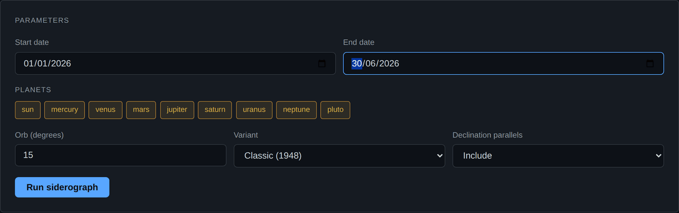
Every input field
| Field | Accepted values | Default | What it does |
|---|---|---|---|
| Start date | 1900-01-01 to 2050-12-31 | One year ago | First day of the curve. |
| End date | 1900-01-01 to 2050-12-31 | Today | Last day of the curve. The range cannot exceed 10 years. |
| Planets | Sun, Mercury, Venus, Mars, Jupiter, Saturn, Uranus, Neptune, Pluto | All nine | Which bodies take part. At least two are required. The Moon is not accepted. |
| Orb (degrees) | 0.5 to 30 | 15 | How far from exact an aspect can be and still contribute. Wider orb gives a smoother, slower curve. |
| Variant | Classic (1948) | Classic | Only Bradley's original formula is implemented. The dropdown exists for future variants. |
| Declination parallels | Include, Exclude | Include | Adds the Venus and Mars declination term D. Only applied if both Venus and Mars are selected. |
The long term multiplier is not on the form
X is fixed at 4, which is Bradley's own weighting. The API accepts values from 1.0 to 5.0 in long_term_multiplier, but the web form does not expose it, so every run you make in the app uses 4. Raising X makes the slow outer planet component dominate; lowering it lets the fast Sun and inner planet terms show through.
Worked example
Build a siderograph for the calendar year 2026 and read its turning points.
- Open the module. Sign in, then choose Bradley Siderograph on the dashboard.
- Set the range. Start date
2026-01-01, end date2026-12-31. That is one year, so this run will cost 3 units. - Leave all nine planets ticked. Removing a planet removes every pair it belongs to, which changes the shape of the curve, not just its amplitude.
- Leave the orb at 15. This is Bradley's figure. Come back and try 8 later so you can see what the orb does.
- Leave declinations included. Both Venus and Mars are selected, so the D term will actually be applied.
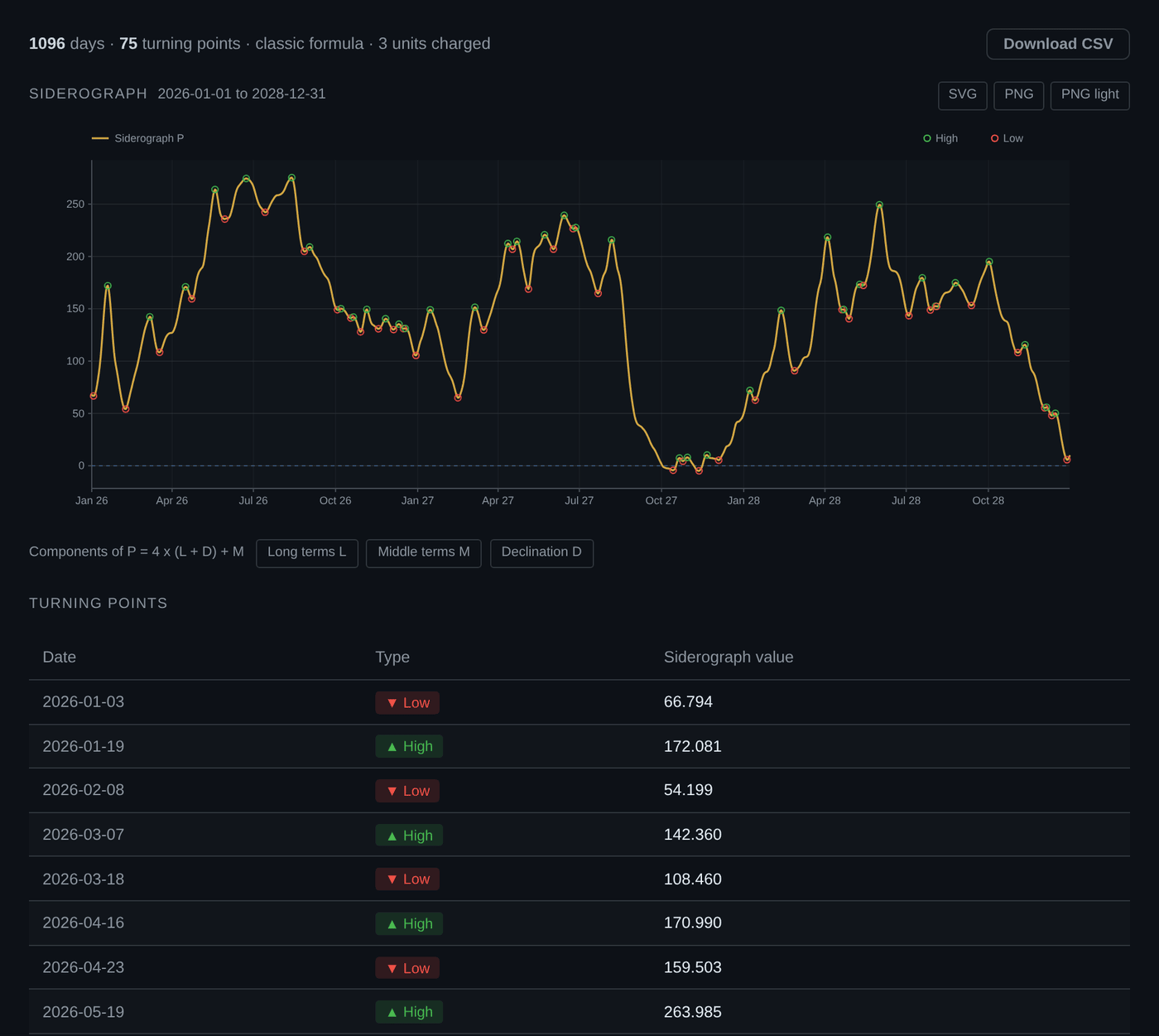
- Click Compute. The chart draws the gold curve, a dashed blue zero line, and a hollow circle on every turning point, green for a high and red for a low.
- Read the turning point table below the chart. Each row is a date, a type (high or low) and the siderograph value on that day.
- Re-run with the orb at 8. The curve becomes spikier and you will usually get more turning points, because pairs enter and leave contribution faster. Note which dates survive both settings. Those are the ones driven by the geometry rather than by your orb choice.
Reading the chart
The siderograph is drawn between the summary bar and the turning-point table. It plots against a real date axis, not an array index, so month gridlines land on month boundaries and every point on the curve lines up with the row that describes it.
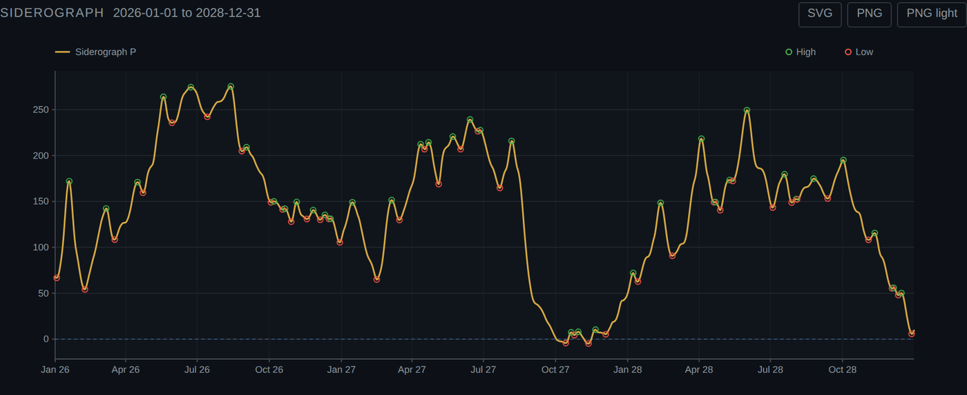
What each mark means
| Mark | Meaning |
|---|---|
| Gold line | The composite P, which is the siderograph itself |
| Green hollow circle | A detected high, a local maximum of P |
| Red hollow circle | A detected low, a local minimum of P |
| Dashed horizontal line | Zero. Crossings of it are what most readers of Bradley watch for |
The three component toggles
Underneath the chart are three buttons: Long terms L, Middle terms M and Declination D. The composite is built from them, by the formula printed above the buttons:
Switch one on and it is drawn alongside P. This is the part a single curve cannot tell you: whether a given turn is being driven by the slow long-term component, by the faster middle terms, or by declination. All three were always computed. Until now they were computed and thrown away.
They are off by default, so the first view you get is the plain composite everybody expects. Whatever is on screen is what a download contains, so switch the components on before you export if you want them in the file.
The worked example, read off the chart
The run above covers 2026-01-01 to 2028-12-31. The summary bar underneath reads 1096 days, 75 turning points, classic formula, 3 units charged, which is the whole cost and scope of the run in one line.
Seventy-five turns over 1096 days is roughly one every fifteen days. That number is worth holding on to, because it sets what the chart can and cannot be used for. A curve that turns twice a month is describing a rhythm, not marking rare events, and treating each hollow circle as a significant date individually would be reading far more into it than the calculation supports.
Turn one component on and watch a single turn
Pick a turning point, then switch on Long terms L. If L is flat through that turn, the turn came from the faster terms. That is a five-second question to ask of the chart and an impossible one to ask of the table.
Reading the output
| Element | What it is | How to read it |
|---|---|---|
| The gold curve | The daily value of P | A dimensionless index. Its absolute size depends on your orb and planet selection, so values from two different runs are not comparable. |
| Zero line | Drawn only when the curve crosses zero | Zero means positive and negative aspect contributions cancelled out that day. It is not a neutral or a boundary in any market sense. |
| Green dot, High | A local maximum | The curve was higher on that day than on the two days either side. |
| Red dot, Low | A local minimum | The curve was lower on that day than on the two days either side. |
| Siderograph value | P on the turning point date | Useful for ranking turning points within one run. A larger absolute value means a stronger concentration of aspects. |
| Days count | Number of days computed | Equals your date range inclusive. |
A turning point is found by a five day window: a day qualifies if its value is the highest or lowest of itself and the two days on either side, and if it differs from the previous day. The first two and last two days of your range can never be turning points, because the window does not fit. If you care about a specific date, extend the range at least three days past it.
"High" and "Low" describe the curve, not the market
The chart legend labels a high as a potential top and a low as a potential bottom. That is the traditional description of the siderograph and it is how Bradley presented it. Crohamhurst makes no such claim. What the software actually computed is a local maximum or minimum of a planetary index. Whether any market did anything on that date is not part of the calculation, is not tested here, and is for you to research.
The CSV export
The Download CSV button writes one row per day:
The file is named bradley_<start>_<end>.csv. The turning points are not in the file, because they are derivable: any row that is a local extreme over a five day window is a turning point. The export is the raw curve so you can align it against your own series in a spreadsheet or a notebook.
Limits and caveats
- Daily resolution, sampled at 12:00 UT. Every day is evaluated once, at noon Universal Time. Fast moving geometry involving the Sun or Mercury can peak between samples.
- The scale is arbitrary. P has no unit. Changing the orb changes the amplitude of the whole curve, so do not compare a 15° run against an 8° run by value.
- The declination term needs both Venus and Mars. Untick either and D is dropped silently, even with declinations set to Include.
- Jupiter and outward are barycentres. Positions come from the JPL DE421 kernel, where the outer planets are represented by the barycentre of the planet and its moons. The difference is far below the orb.
- DE421 covers 1899-07-29 to 2053-10-09. The API restricts you further, to 1900-01-01 through 2050-12-31.
- No back test is included. Crohamhurst does not evaluate whether the siderograph has predicted anything. It computes the 1948 formula faithfully and shows you the result.
What this tool does not tell you
It does not tell you direction, it does not tell you magnitude, and it does not tell you which turning points matter. It gives you a curve and its extremes. Any interpretation beyond that is yours.
Common mistakes
| Mistake | What happens | Fix |
|---|---|---|
| Trying to include the Moon | The request is refused with "moon is not part of Bradley's formula" | Bradley's terms use only the Sun and the eight planets. Use the Ephemeris module if you want lunar aspects. |
| Comparing values between runs with different orbs | You conclude one period is "stronger" when you only widened the orb | Compare shapes and dates, not values, unless every setting matches. |
| Excluding Venus or Mars but leaving declinations on | D is quietly dropped and the curve changes more than expected | Keep both, or set declinations to Exclude so you know what you are looking at. |
| Requesting more than 10 years | Validation error before anything is computed | Split the request. Two 10 year runs cost 30 units each. |
| Reading a turning point on the first or last day | There is none, ever | Pad the range by at least three days at each end. |
What it costs
Bradley is charged at 3 compute units per year of the requested range, minimum 1.
| Range requested | Units charged |
|---|---|
| 1 month | 3 |
| 1 year | 3 |
| 3 years | 9 |
| 10 years, the maximum | 30 |
Units reset daily at midnight UTC, and a failed request costs nothing, because usage is recorded only after a computation succeeds. See pricing for the daily allowance on each plan.
Not financial advice
Crohamhurst is a calculation tool. It produces dates, degrees, levels and tables. It does not produce recommendations, signals or forecasts, and nothing in this guide is financial advice. Trading carries risk of loss.