How to Use the Bradley Siderograph: A Worked Example on the 2020 Market Crash
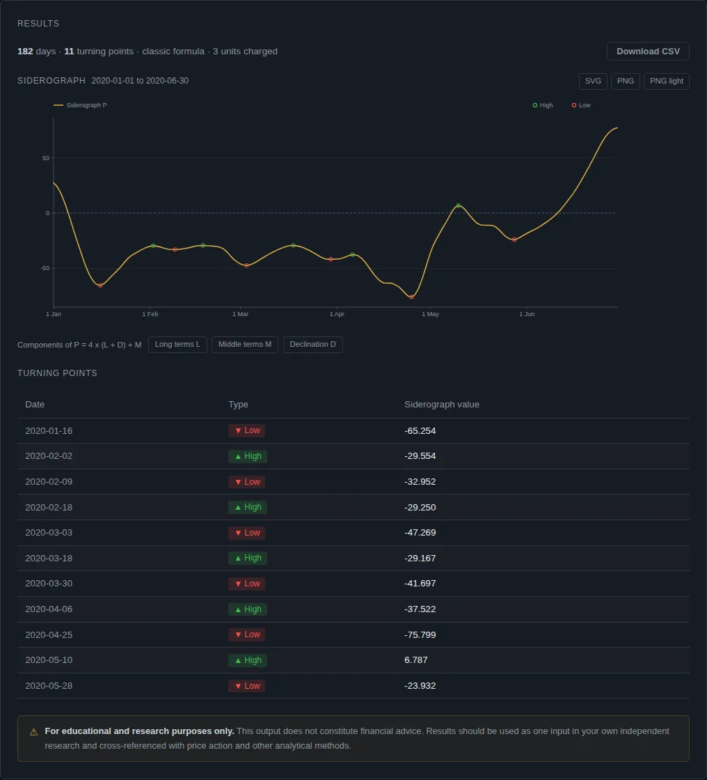
To use the Bradley siderograph, choose a date range in the app, run it, and read the table of turning points: each row is a date the curve changes direction, marked as a high or a low. For January to June 2020 the app gives 11 turning points. One of them matched the S&P 500 peak almost to the day. The crash low was a week out.
What you are looking at
The siderograph is one curve built from planetary angles. The formula is Bradley's 1948 one, P = 4 × (L + D) + M. The app computes the curve, finds its local highs and lows, and lists them. It does not say whether a high will be a price high. That is a claim people make about the method, and you can check it yourself against price. Our complete guide covers the history.
Step by step
It costs 3 compute units for a half-year range.
- Sign in at crohamhurst.app and open the dashboard.
- Choose Bradley siderograph.
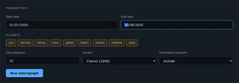
- Set Start date to 1 January 2020 and End date to 30 June 2020.
- Leave the planets and orb on their defaults.
- Press Run computation.
Reading the result
| Date | Type |
|---|---|
| 2020-01-16 | Low |
| 2020-02-02 | High |
| 2020-02-09 | Low |
| 2020-02-18 | High |
| 2020-03-03 | Low |
| 2020-03-18 | High |
| 2020-03-30 | Low |
| 2020-04-06 | High |
| 2020-04-25 | Low |
| 2020-05-10 | High |
| 2020-05-28 | Low |
Each row is a local extreme of the curve. The "Components" buttons on the chart let you switch the long-term, middle-term and declination parts on and off, so you can see which term drives a turn.
Checking it against the S&P 500
We compared these dates with S&P 500 closing prices (Yahoo Finance, ticker ^GSPC, pulled 11 October 2026).
- The peak. The S&P 500 closed at its high of 3386.15 on 19 February 2020. The app shows a high on 18 February, one day earlier. That is a good match.
- The crash low. The lowest close of the sell-off was 2237.40 on 23 March 2020. The app shows a low on 30 March, seven days later. The index had already risen 17% from its low by then (2626.65 on 30 March against 2237.40). That is a miss on timing.
- The 18 March "high". The app marks 18 March as a high. The index closed at 2398.10 that day, in the middle of the fall. It was not a turning point in price.
One hit, one near miss and one wrong call out of three dates is a small sample and proves nothing about the method. We show it because worked examples that only show the hit are advertising. Over the last 21 months of S&P 500 data, we found the siderograph's turn dates matched price pivots no more often than chance would (see our forward test for October to December 2026).
What to do next
Pick a market you follow and a past period you remember. Run the siderograph, put the turning dates on the chart and mark the real highs and lows. Count hits and misses against a rule you wrote first, such as "within 3 calendar days". Then compare with how often random dates would hit. Without that last step, a few hits feel like proof and are not.
Common mistakes
- Scoring only the hits. If you look at a chart after the fact, you will see dates that line up. Write the rule first, then count every date, including the ones that missed.
- Skipping the baseline. With a 3 day window, a random date lands on a price pivot about 30% of the time on the S&P 500 data we used. A 40% hit rate is not far above that.
- Using too short a window. Eleven turns from six months is a small sample. Use years of data before drawing a conclusion.
What this does not tell you
The curve gives dates, not direction or size. A "high" on the curve can be a price low. The method has no stated reason why planetary angles should move prices, and our calibration did not find an edge.
Questions people ask
What is the Bradley siderograph? A curve made from planetary angles, published by Donald Bradley in 1948, whose turning points are claimed to line up with market turns.
How do I read the turning points? Each row is a date where the curve changes direction. A high means the curve peaks, a low means it troughs. Neither says what the price will do.
Does it work on any market? The dates come from planets, not prices, so they are the same for every market. You test them against the price series you care about.
How much does it cost in the app? Three compute units for a range this size, from the Free plan's 50 a day. See the Bradley guide.
General information only. This is not financial advice. Past patterns do not guarantee future results. Consider your own circumstances, or speak to a licensed financial adviser, before making any investment decision.
Crohamhurst computes the Square of Nine, Bradley siderograph, planetary ephemeris, cycle scans and historical analogs from your own price data, in your browser. The free plan needs no card.
Create free account